A foundational design system and component library for Elanco Knowledge Systems, built to unify a fragmented post-M&A ecosystem and support scalable, data-driven, and AI-enabled products.
Company
Elanco Animal Health
Timeline
2022–2024
Role
Lead UX Designer
Tags
Design SystemSustainabilityAICarbon Credits
01 — The Brief
A shared system for a fragmented post-M&A ecosystem.
Following the Bayer Animal Health acquisition, Elanco inherited a fragmented ecosystem of tools, workflows, and knowledge systems spanning more than 400 products. The existing style guide was largely print-based, which meant it lacked the structure needed for modern digital products, responsive interfaces, and the kind of reusable patterns required across product, sales, and operations.
400+
products sitting inside a fragmented ecosystem that needed a more durable digital foundation
2022–24
timeframe for building and applying the system across internal product and communication work
Web+
platform-agnostic system thinking across web, tablet, mobile, and presentation surfaces
What It Needed To Do
Evolve a print-first style guide into a scalable, digital-first system of tokens, components, and patterns that could support real product work.
Why It Mattered
The system became the base for the UpLook redesign and helped create the conditions for fast-moving work like ElancoGPT to feel coherent and trustworthy.
The token sheet below is not the whole project. It is one artifact inside the broader design-system effort: a way to document how the system should behave in code and in practice.
02 — System Scope
Brand, structure, and reuse all had to align.
The absence of a unified digital-first design system limited consistency, scalability, and cross-platform integration. UpLook and EKS Passport onboarding still depended on manual, sales-assisted processes, while interactive and data-heavy products had no strong system to build from. The design system had to bridge that gap: enough brand fidelity to feel like Elanco, but enough structural rigor to support modern workflows.
Team
Cross-functional collaboration with solution engineers, front-end, data/AI teams, EKS Operations, sales, and technical consultants.
Role
Lead UX Designer & Researcher, with responsibility spanning system definition, interface direction, and product alignment.
Goal
Create a scalable digital-first system that could support data-driven and AI-powered products, starting with UpLook and extending outward.
Brand Translation
Logo lockups, slash motifs, title frames, and core palette decisions.
Template Logic
Repeatable deck and infographic layouts that could be used without redesigning the structure each time.
Product Readiness
A more durable system of spacing, hierarchy, breakpoints, and utility classes that could translate into real UI work later.
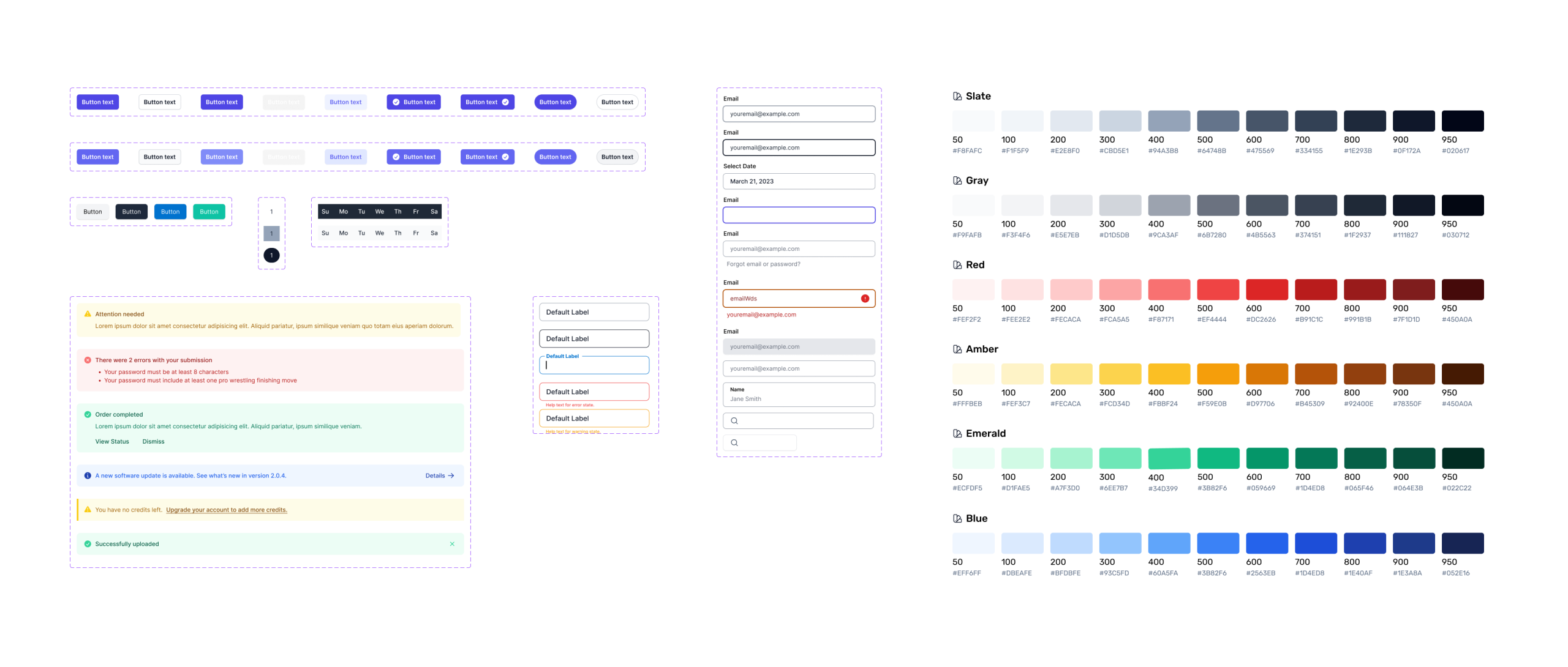
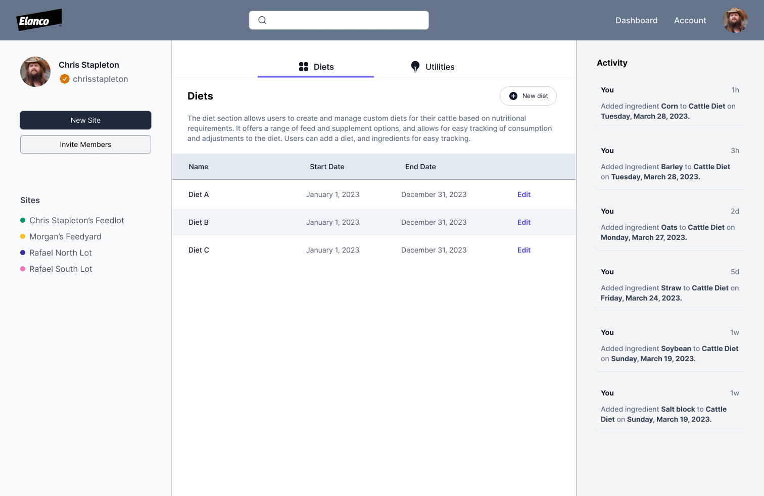
A core system board covering buttons, inputs, alerts, states, and the broader color vocabulary. This works better as a case-study artifact than as a standalone hero because it shows the system actually taking shape.UpLook as the first major implementation: a data-driven operational product where the design system moved from theory into real product behavior, navigation, and layout structure.
03 — Assessment + Audit
Start with the inventory, not the redesign.
The first step was understanding what already existed across the component library, accelerators, and adjacent UI work. The goal was not to throw everything away. It was to get a general read on UX gaps, identify what could be kept, merged, or retired, and understand what it would take to support a more real design workflow across design and development.
Assessment Objective
Inventory the components already in place, identify gaps, and understand where current patterns were too heavy, inconsistent, or hard to extend.
Key Questions
What do we keep, what do we kill, what gets merged into something stronger, and what needs to be enhanced for a real product workflow?
Product Direction
Modernize EKS so the product team could actually use a component library as a shared operational tool, not just a loose visual reference.
04 — Demo
A walkthrough of the system as a working artifact.
The design system was not just a token inventory. It also had to work as a shared reference between design, development, and product, and this demo helps show the system in that more practical form.
Why It Matters
A live walkthrough makes the structure, patterns, and intended use of the system more legible than a static sheet alone.
A short demo showing the Elanco Design System in use as a working internal resource.
05 — Reordered Notes
1. Foundations
Colors, typography, icons, spacing, grids, and motion formed the base layer.
Primary and secondary Elanco colors anchored the system visually.
The system needed enough flexibility to support branded decks, diagrams, and product-facing UI work.
2. Components
Navigation, cards, header/body structures, buttons and states, inputs and forms, and other basic UI elements were the priority set.
The component layer was meant to be reusable, not a collection of one-off screens.
Accessibility, responsiveness, and consistency were part of the definition of done.
3. System Principles
Maintain the Elanco look and feel, but make the system more robust and usable.
Support multiple themes and screen sizes where needed.
Keep the system maintainable as an evolving document shaped by business and user needs.
4. Governance
Clarify ownership through a design system owner and cross-functional team.
Define approval and maintenance processes for changes, updates, and bug fixes.
Use collaboration, communication, and feedback loops to keep design and development aligned.
5. MVP + Rollout
Work in parallel across repository setup, the Figma system file, and implementation guidance.
Create a shared document between design, development, and product.
Focus first on the basic UI elements, accessibility, and responsiveness.
6. Outcomes + Testing
Outputs included Figma components, code implementation, and Storybook-style documentation.
Testing needed to cover accessibility, interaction behavior, snapshot baselines, and visual regressions.
The goal was a living component library that could support product work over time.
06 — Token Sheet / Color
Primary
Copied
Elanco Blue
#0070CE
Brand anchor
Secondary
Copied
Navy
#102A71
System depth
Copied
Teal
#1DC7BB
Accent
Copied
Sand
#DED6CA
Support
07 — Token Sheet / Type Scale
Display
Healthy Purpose
88px · wt 700 lh 0.95 · ls -0.045em
Heading 1
Infographics
64px · wt 700 lh 1.0 · ls -0.03em
Heading 2
Template Layouts
48px · wt 700 lh 1.05 · ls -0.02em
Heading 3
Slash Construct
32px · wt 700 lh 1.15 · ls -0.01em
Body Large
A shared system for charts, presentation layouts, and internal product surfaces across Elanco Knowledge Systems.
20px · wt 400 lh 1.5 · ls 0
Body
The system had to support brand communication, structured storytelling, reusable deck templates, and product-adjacent UI patterns without fragmenting into one-off files.
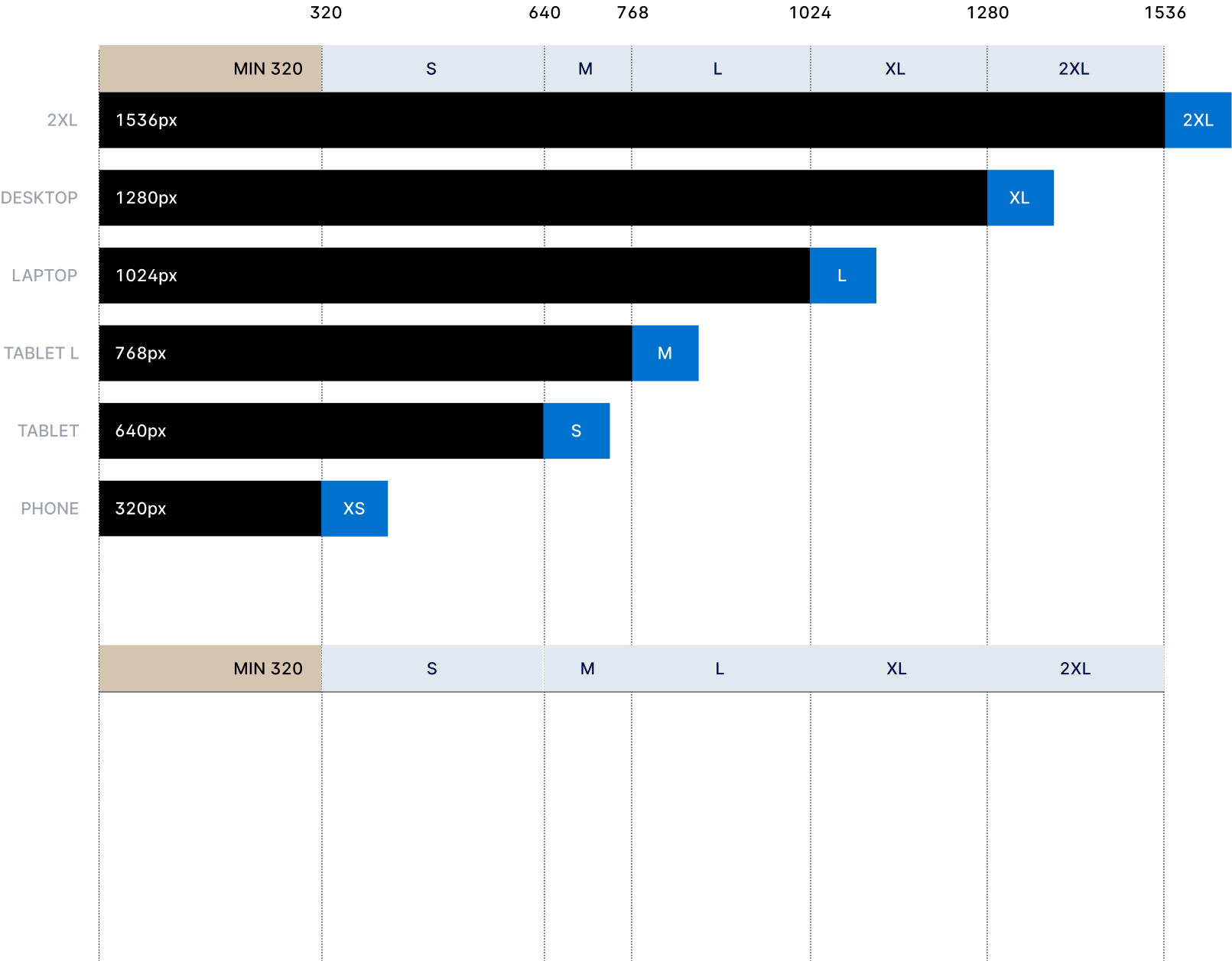
Instead of treating breakpoints as abstract numbers, this demo makes the system feel tangible. Slide through the screen sizes and the viewport adapts from compact to widescreen, showing how layout density, navigation structure, and card grouping shift across the Tailwind screens.
sm
640
md
768
lg
1024
xl
1280
2xl
1536
`lg` at 1024px: side navigation and a three-card content grid become comfortably available.
The original breakpoint diagram from the portfolio. The slider above is a more interactive translation of the same idea for this case study.